I think that Kristie and I could be kindred spirits. I didn't tell her this when I met with her about doing her wedding invitations (for fear of her being freaked out), but I really think it could be true.
You see, two and a half years ago when I got married, I knew one thing - I wanted to have bright wedding colors. I chose bright pink, green, and purple. You can even look back and see it it here if you'd like. I love bright colors and always have.
So when Kristie came to me with her hot pink/turquoise wedding colors, I knew I'd found a girl after my own heart. To top it all off, she picked one of the most beautiful Envelopments patterned papers to work with.
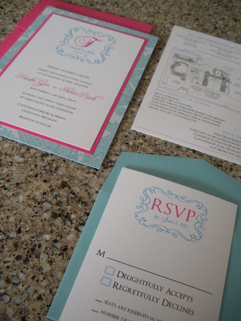
Here is the completed invitation suite, in all its bright glory.
The invitation suite included the invitation, one insert (combined directions and accommodations card), and the RSVP. Kristie picked out one of my favorite colors - Caspian - to use for the RSVP envelope, and Valentine for the outer envelope. The patterned paper is one of Envelopments' Regalia card stocks.
Even though the Regalia paper was beautiful enough, for the actual invitation we still wanted the invitation to pop a little more, so we brought in just enough of the Valentine paper to do the trick.
We also designed a custom frame for Steven and Kristie's monogram. I was able to design the frame by hand (well, using Adobe Illustrator) and then we use Baroque Antique Script for the 'F' and Freebooter Script for their names. The block font we brought in to the invitation was none other than Optimus Princeps, my forever favorite font.
The accommodations/directions card included a map of Castle Farms, the location of their ceremony and reception. Castle Farms is large, with a ton of space for weddings, so we included a little key to get the guests where they need to be.
We brought the frame into the RSVP card...
and the band we wrapped around the invitation, too.
The band held everything together in the envelope so nicely.
The back of the suite. Love the shimmery white paper she picked out.
Instead of printing directly on the envelopes (since the envelope was a thicker card stock), I made an address label for each of them.
The address label carried over to the back of the invitation where the return address was listed.
I really loved how these turned out, and I'm not the only one. My husband and I are staying with my parents until our house is all set for us, so I was working on assembling these at their kitchen island a few weeks ago. My mom came over and was looking at them one night and said, "these are the most beautiful invitations I've ever seen." I know she's my mom, but the woman does have good style. :)


I think these may be one of my favs. They look so pretty, I'd describe them as yummy! You guys are kindred spirits! I could totally imagine getting an invitation like this from you, Jenny! Great job!
ReplyDeleteNance does have good style. These are beautiful, and I absolutely love the address label you made. Very clever Jennifer.
ReplyDelete