Thursday, May 31, 2012

Mike's Mad Men Invitations

This is a blog post about a birthday party invitation, with some WE'REMOVINGIN2DAYS mixed in. If you are here to see a birthday party invitation and only a birthday party invitation, you've been warned.

To review, this happened...


Luke and I are the proud new owners of a little bungalow and we couldn't be more excited. So I have to admit that it's hard to think about anything right now aside from her (the house is clearly a she).

(Yes, there is a porch swing hanging on that porch, and yes, it will be left for us. When the previous owner texted to ask me if we wanted it, I replied with an enthusiastic "Oh, yes yes YES!" She may think I'm weird.)

We've actually been the owners since March 9. That's right...80-some days ago. Which means that I've had 80-some days to obsess over what colors to paint, how to decorate, what things to buy, what things to wait to buy, what to use each room for, and so much more.

But wait...this is a post about some Mad Men invitations. Right.

So one of my BFFs, Heidi, has a husband named Mike. You might remember Heidi and Mike from this post or this post. One thing about Heidi: she knows how to throw a party. So much so that she's started a blog called Parties for Pennies. She loves to host parties and save money at the same time. She's thrifty like that.

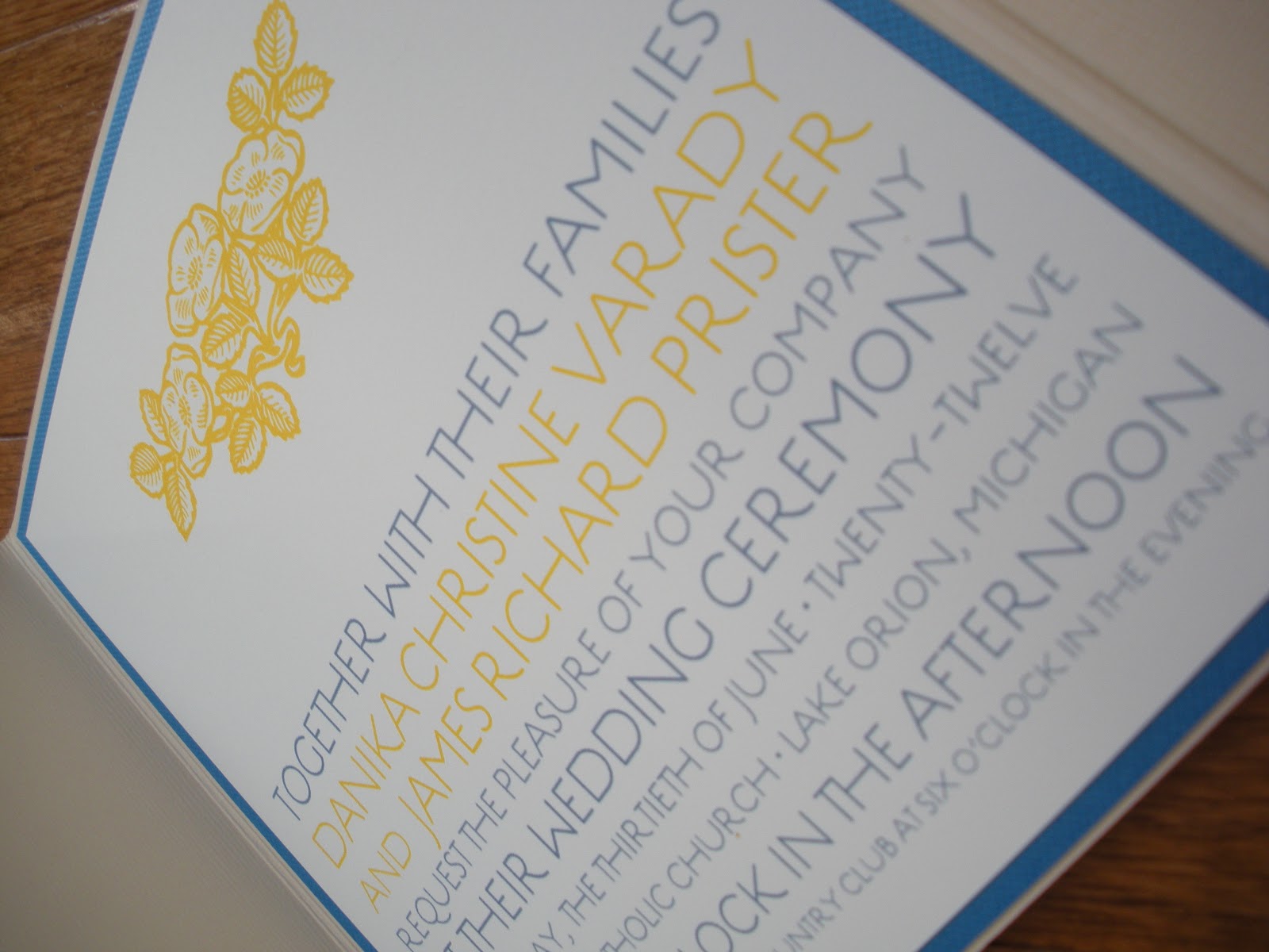
So when Heidi's husband was turning 40, she wanted to do something extra special for him. Since he likes the show Mad Men, she thought she'd use that as her theme. And she decided that she wanted to let everyone know about her party with an invite that set the tone. And...she came to me to do it. What a pal!

After much staring at Mad Men images that I found online (how you doin', Jon Hamm?), I gained the inspiration I needed to create what I hoped to be the perfect invitation.

{Psssst - this Mad Men invite is now available at Vivian Elle's Etsy Shop. Click here to visit and order it for your own party!}


Confession: Once again, I have stolen images from my beloved friend, Heidi. This was due to an unfortunate event that occurred a few days ago when I accidentally deleted every photo that I had uploaded to this blog post only to realize that I had also deleted them off of my camera. It just doesn't get better than that, folks.

While Heidi wanted me to make the invitations, she had a really cool idea for the envelopes, so she did those herself. They turned out perfectly and I will now steal another photo from her blog and show you them here.


My crafty friend inspires me all the time.

I am so grateful to Heidi that she would trust me with such an important event, and a successful one at that. You can check out how her party went here and here.

In conclusion, it now just needs to be stated that when I write my next blog post, we will be living in our new house. Most likely with just a bed, half painted walls, and a leftover pizza as our only food, but our new house nevertheless. I promise to not take over every blog post with some kind of Young House Love-ish post about all of the plans we have for our bungalow, but I cannot help it if one or two photos sneak in there...

Want to hear more about the value of custom invitations? Check out this post

Thursday, May 24, 2012

Leanne's Baby Shower Invitations

Babies. 

I'm 31. Do you think that having babies has crossed my mind a time or two?

Unfortunately, I overanalyze anything and everything (to the point where my own father, who officiated our wedding, pointed this out to all of our guests during the ceremony...awesome). When Luke and I entered our second year of marriage, I remember I started thinking about babies a little bit more. Not ohmygoshgivemeababynow or anything, but I guess I started noticing that I liked them a lot more than I ever had. So I started thinking...am I ready to have one of my own?

Then I'd think that I don't want to wake up several times a night and be sleep deprived for the rest of my life. 

Then I'd think that having a little human running around that is a part of me and a part of my husband would be so cool.

Then I'd think that my husband and I won't get to spend as much time together, just me and him. 

Then I'd think of all the joy that a baby would bring to our lives.

And so on and so on. 

It's been several months since I entered into that second year of marriage, and I'm still not sure when I (or my husband) will be ready for our own little tyke, but I am always extremely happy for my friends that have made the transition to motherhood, and I love learning everything I can from them. And...I love making invitations for their baby showers (10 points for an amazing transition!).

(-25 points when you realize that this shower invite is for a girl I've never even met, making the introduction to this invitation baby-related word vomit.)

I helped Erin with her wedding invitations last summer. I had a great time working with her - she really was an extremely calm bride-to-be. She was very cool, collected, and I really liked how she did her hair.  A month or so ago, she came to me again to ask about doing baby shower invitations for a friend of hers. I, of course, took this as a great compliment (love me a return customer) and was more than happy to help out. 

Erin first sent me some pictures of her ideas for decorating. She was using blues, yellows, and reds. She had a million adorable ideas, but one stuck out to me in particular - these cute paper flower fans. 

(Not sure what I'm talking about? You can view them here, here, or here.)

I decided I just really liked them and that they couldn't be that hard to make on my own. I started creating the same paper flower fans in Illustrator and our shower invitation was born. 


I absolutely love the color scheme that Erin decided to use. Leanne and her husband are having a boy, but the color scheme isn't overly boy-ish at all. I give a solid thumbs up to that. I definitely believe that a girl shower does not equal all things pink, just like a boy shower doesn't have to be completely done in blue (or green, if you're really getting crazy).


The fonts? Arial Black and Context Reprise Light (this one's my current favorite). We used a dark blue envelope and white linen card stock.


All in all, I love my return customers and am forever grateful that they would actually use me again. And since I truly enjoy working with my brides, working with them a second time is pretty much a complete joy.

I've been doing more and more shower invitations, which I absolutely love. Stay tuned for some more in the coming weeks. :)

Thursday, May 17, 2012

Abby and Seth's Wedding Extras

I met Abby several months ago now and we've been through a lot together in a little bit of time. First we worked on her wedding shower invitations. Then the wedding invitations

Last, but certainly not least, we have Abby and Seth's wedding extras. The programs, the menus, the table numbers, the seating chart...those extra things that help your guests figure out who those people are at the front of the church, where to sit at the reception,  and what they'll be eating. 

The best part about Abby and Seth's wedding extras? I actually attended this wedding, so I got to see them in action (in other words, looking nice in their respective places). 

You see, Abby married my father's cousin's son. So we are kind of related now. She might be my second cousin twice removed...I'm still not sure.

The wedding was beautiful. The food was fabulous. The bride was stunning. And it was so cool/weird to look everywhere and see work that I actually did. Seth and Abby used the custom frame that we come up with for their wedding invitations in so many aspects of the wedding. When we walked into the reception, they actually had it projected onto one of the walls. You might think I took a picture of that.  Not so. 

But I did take a picture of the extras that I had worked on. So let's roll these out, one by one. 

First, we have the programs. We kept everything consistent with the papers and fonts we already had used. We used a simple piece of 4x9 First Snow card stock to print the programs on. We had a lot to fit on there (16 members of the wedding party + the ceremony),  but we managed without having to use super tiny font. 


We also used the same size card stock for the menus. They set two of these at each table. Let me state again...the food was GOOD.


Here are the table numbers. We used the White Snow card stock and Majestic (purple) backing.

My mom even stole their table number and it sits on her dining room table to this very day. A thief, that one.


And finally, here's the seating chart. This was set outside of the reception, so guests could use it to find their tables. It's great to have everything in one place, and easy to reference because the names are in alphabetical order...especially helpful for larger weddings.


Their wedding favor to their guests was a photo booth. They even put the frame at the bottom, with their wedding date in it. My family loves a photo booth. I particularly love that half of my mom's face is covered by the horn on my husband's hat, and that my dad is just grinning from ear to ear in the background.


My family and I had a wonderful time at the wedding, and it made it even better that I had the chance to  get to know the bride beforehand. She's a wonderful girl and will be a great wife to my cousin.

Congratulations, Seth and Abby!

Thursday, May 10, 2012

Steven and Kristie's Bright Invitation Suite

I think that Kristie and I could be kindred spirits. I didn't tell her this when I met with her about doing her wedding invitations (for fear of her being freaked out), but I really think it could be true.

You see, two and a half years ago when I got married, I knew one thing - I wanted to have bright wedding colors. I chose bright pink, green, and purple. You can even look back and see it it here if you'd like. I love bright colors and always have. 

So when Kristie came to me with her hot pink/turquoise wedding colors, I knew I'd found a girl after my own heart. To top it all off, she picked one of the most beautiful Envelopments patterned papers to work with. 

Here is the completed invitation suite, in all its bright glory.


The invitation suite included the invitation, one insert (combined directions and accommodations card), and the RSVP. Kristie picked out one of my favorite colors - Caspian - to use for the RSVP envelope, and Valentine for the outer envelope. The patterned paper is one of Envelopments' Regalia card stocks.

Even though the Regalia paper was beautiful enough, for the actual invitation we still wanted the invitation to pop a little more, so we brought in just enough of the Valentine paper to do the trick.

We also designed a custom frame for Steven and Kristie's monogram. I was able to design the frame by hand (well, using Adobe Illustrator) and then we use Baroque Antique Script for the 'F' and Freebooter Script for their names. The block font we brought in to the invitation was none other than Optimus Princeps, my forever favorite font.


The accommodations/directions card included a map of Castle Farms, the location of their ceremony and reception. Castle Farms is large, with a ton of space for weddings, so we included a little key to get the guests where they need to be.


We brought the frame into the RSVP card...


and the band we wrapped around the invitation, too.


The band held everything together in the envelope so nicely.


The back of the suite. Love the shimmery white paper she picked out.


Instead of printing directly on the envelopes (since the envelope was a thicker card stock), I made an address label for each of them.


The address label carried over to the back of the invitation where the return address was listed.


I really loved how these turned out, and I'm not the only one. My husband and I are staying with my parents until our house is all set for us, so I was working on assembling these at their kitchen island a few weeks ago. My mom came over and was looking at them one night and said, "these are the most beautiful invitations I've ever seen." I know she's my mom, but the woman does have good style. :)

Thursday, May 3, 2012

James and Danika's Modern Pocketfolds

Danika is doing what a lot of girls are doing: planning a wedding while they're in grad school. Having never done this myself, I can't even imagine what it would be like. When would you plan? At 2 AM after you finally finished going to class, studying, and (maybe) eating something? And then when you finally find the time, aren't you completely out of energy to make any of the decisions that you need to make when you wedding plan?

Just thinking about it makes me tired. 

Luckily, after Danika initially picked out the product for her invitations, her mom, Terri, stepped in to help her out during this hectic time. I've been communicating with Terri ever since and it's been great. 

(We must pause here and give props to moms everywhere that swoop in and help us daughters when we really need it.)

After working with Danika on her save the dates back in December, I knew that design and a love for paper products was in her blood. When I met her mom, I saw that I was correct - this family has a great eye for design. 

Let's look back at Danika's save the dates, just for fun. 


We wanted to keep the same modern layout that we did for her save the dates. We added in some color and vintage floral artwork and we had ourselves an invitation suite. 


I have to stop here and declare my love for these invitations. I love how beautifully the vintage artwork and modern font fit together.


We colored the font (Estilo) and the artwork blue and marigold, which are Danika's wedding colors.


Accommodations, Reception, and RSVP cards.


I love the simplicity of the inserts.


We added one more piece of vintage floral artwork to the directions card. So pretty.


It's a shame that you can't see more of the floral patterned card stock that's behind this RSVP. It is honestly my favorite patterned paper that Envelopments carries. But Danika's guests will get to see it because we're using it for their place cards at their wedding. So consider this a little sneak peak.


The entire suite, completed with bright blue (Envelopments calls it 'Peacock') textured envelopes.

There's still more to come...menus, programs, and place cards to be exact. Excited to work more with this bride (and her mom)!