Showing posts with label Modern wedding invitations. Show all posts

Monday, September 29, 2014

Sam and Jeff's Purple and Orange Wedding Invitation Gate Cards

I'll use one word to define Sam and Jeff: FUN. 


Purple and orange and a white gate card with a barque texture made for a quirky, but upscale invitation.


This invitation suite was nice and simple: gate card that held the invitation and a sweet little RSVP.


Fonts are Clicker Script and FHA Condensed French.


The RSVP choices were:

gladly attend
regretfully attend
regretfully decline
enthusiastically decline
will decline to respond but ultimately attend

Like I said, fun. :)


Just look at that texture.


Congratulations, Sam and Jeff!

All images are from Casey and her Camera. Check out her website or visit her on FB here

Sunday, September 21, 2014

Amy and Steve's Yellow and Gray Castle Farms Invitations

Amy and Steve came to me months ago to help them design their Castle Farms wedding invitation. Amy wanted to keep their wedding suite simple and modern - and she wanted to feature a picture of Castle Farms while doing it. 


We decided on a night time picture of the castle. Considering her colors were yellow and gray, the night photo fit in perfectly.


Fonts were Allura and Champagne and Limousines.


The back of the invitation conveniently had directions and website information on it.


The RSVP asked guests to pick their favorite slow jam and fast jam.


Congratulations, Amy and Steve!

All images are from Casey and her Camera. Check out her website or visit her on FB here

Tuesday, January 28, 2014

Colleen and Maxwell's Mint and Pink Gate Cards

Today I'm so excited to show you something I don't get to show very often - Envelopment's beautiful gate cards.  I'm an admirer of these gate cards, and Colleen and Max picked out one in mint, which makes it even better.


Here's what guests see when they pull these cards out of their envelopes.


And here's what they see when they open the card.


First, we have the invitation. I love that the invitation is backed with a dark green and gold, even though the rest of their colors are light. It adds a lot of depth to the invitation.


Colleen and Max wanted a formal feel to their invitations with a modern twist. We thought that the gate card took care of the modern twist, and the script fonts and beautiful papers showed off the formal side of their wedding.


Easily one of my favorite fonts of the year - Adios Script Pro - was used as the script font. Novencento  Wide was used for the block font.


The invitation came with two inserts - an RSVP card and a reception card.


Here are all three pieces together.


Loving these gate cards, loving the fonts, and loving that mint is still going strong as a color choice for weddings in 2014. :) 

Tuesday, October 15, 2013

Trisha and Dave's Detroit Themed Wedding Invitations

Now that Trisha and Dave's Save the Dates are out and the shower's been thrown, it's time for the invitations. 

Trisha decided to use gate cards for her invitations, which means this is what her guests saw when they opened the envelope (can we just pause to admire the lovely coral color of the envelopes, by the way?): 


A sneak peak at the invitation...


And here they are...


(I feel like the invitation's arms are open wide and there should be a heavenly "ahhhhhhhhh" that accompanies this picture.)


We used a new font, Bebas, for the entire invite.


And it's printed on the same map we used for Trisha's business calling cards.


I know I say this about every bride, but I truly love Trish's style. :) Can't wait to see what she has in mind for the wedding extras for the big day!

Tuesday, September 10, 2013

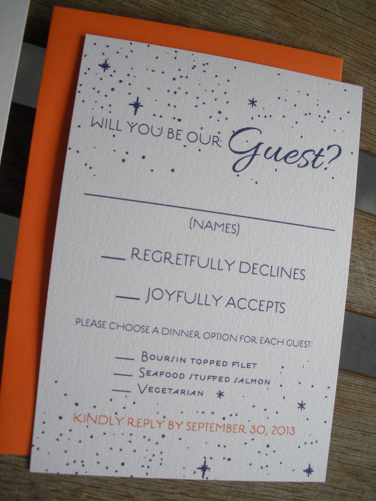
Shannon and Taylor's Starry Night Wedding Invitations

Alright, let's role out more wedding invitations, shall we?

Shannon contacted me because she had seen my wonderful and lovely best friend post things about my business. Shannon and her fiancĂ©, Taylor, live in Chicago, but we set up a skype meeting and got things rolling right then and there. 

Shannon and Taylor are getting married in November and wanted a romantic, starry night theme for their invitations. But it had to be subtle. And non-promy, which was a term that we used a lot in our exchanges. 

Here's what we came up with. 


Shannon and Taylor just wanted a simple, one panel invitation that included an RSVP card.  They picked out Allura and Estilo as their font combo. 


I love how my porch swing has become the standard photo backdrop for all of my invitations. I also just love my porch swing.


As for the envelopes, Shannon actually ordered those on her own. She went with a white envelope with a navy flap for the invite and an ever-so-cute orange envelope for the RSVP card. I love that the orange in the RSVP brings out the little bit of orange we used in the invite and RSVP.


Speaking of the RSVP, I just love this little guy.


So there's another invitation in the books (I have no books). I love how these turned out and Shannon was wonderfully easy to work with. I'd be glad to skype with any bride from the Chicago area, anytime. :)

Tuesday, July 30, 2013

Stephanie and Michael's Modern Wedding Invitations

Like this invitation? Check out this similar design at Vivian Elle's Etsy Shop. 

I truly love working with different styles of wedding invitations. Each bride comes to me with such unique ideas and I love that they trust me to carry those ideas out. 

But every now and then, I end up with a wedding invitation that is exactly my style. And this year, I think this is the one. If I had been married this year, this is the invitation I would have created for my own wedding.


Stephanie was pretty open to ideas about her design. She sent me a few pictures that were her style and then she let me go to work.


I used Samantha Pro for the script font and Novecento for the block font. Both of these are my favorites at the current moment.

As for the colors, we went with a navy blue and coral, a pretty hot color combo for 2013.


All of the information Stephanie and Michael needed to tell their guests was put right on the back of their invite.


I'm seeing more and more brides who are keeping it so simple with their invitations and I love it. One piece of card stock and one envelope can still equal a beautiful wedding invitation.


Stephanie was SUPER easy to work with - so glad she chose Vivian Elle. :)

Lots of fun to come in the next few weeks - wedding invites, save the dates, bridal shower invites, baby shower invites -it's been a fun month!

Tuesday, March 12, 2013

James and Stacey's Wedding Invitations

It's time to post some wedding invitations, y'all!

This is going to be a quick post, mostly because I was away this weekend (more on that later...) and I've been playing catch up all morning. So while I was going to post about my weekend today (and show off a baby announcement at the same time), I'm going to do a little swicheroo and post about my trip later in the week when I have some pictures to show. 

Side note - I am horrible at taking pictures. If I had just decided to post about my trip this weekend with the pictures I took, it would be three pictures of a historic library (which I took for my dad), one picture of a friend standing in front of an inappropriate statue (you're never too old, yo), and one picture of the sweetest little girl that I had the pleasure of hanging out with for a good part of the trip.  Oh, heck. I'll post that one now. Let it be a little sneak peek of what I did this weekend. There were children involved. 


Two things: how cute are those boots and can you see that strawberry hat? ADORABLE. 

But back to wedding invitations. Coral and navy are one of the hot color combos right now, and it just so happens that the first invitation suite I made this year went right along with this trend. 

Here is James and Stacey's wedding suite. 


We decided to bring in the coral with some flower artwork and the envelopes. I loved that they used a navy pocketfold.


Yes, this is actually a pocketfold invitation, though it may not look like it at first. When James and Stacey's guests turn the invitation over, this is what they'll see. 


We kept it simple with one insert and an RSVP. We combined directions and accommodations onto one piece of cardstock.


Then we added in a cute little RSVP card. I love that they wanted to go with "Will you be our Guest?" instead of the normal "RSVP" or "Kindly Reply."


On the left side of the directions card, we created a little map so guests could easily find their way from the church to the reception. It was such an easy route that it's probably just better to look at the map instead of put it in your GPS. And a map is always fun, right?


So wedding invitation season is officially kicked off and I'm so very excited about it! I have such unique invitations this year and can't wait to share them. :)

Next week I'm going to show off a Save the Date and start a new series on FAQs about wedding invitations. On Thursday I'll be right back here to show off the baby announcement for a little guy that I finally got to meet this past weekend. See you then!

Want to hear more about the value of custom invitations? Check out this post